Pages

Showing posts with label color. Show all posts

Friday, December 13, 2013

love a library

I have ALWAYS wanted a home that had a library.  Every time I see a room with walls lined in books, I swoon.


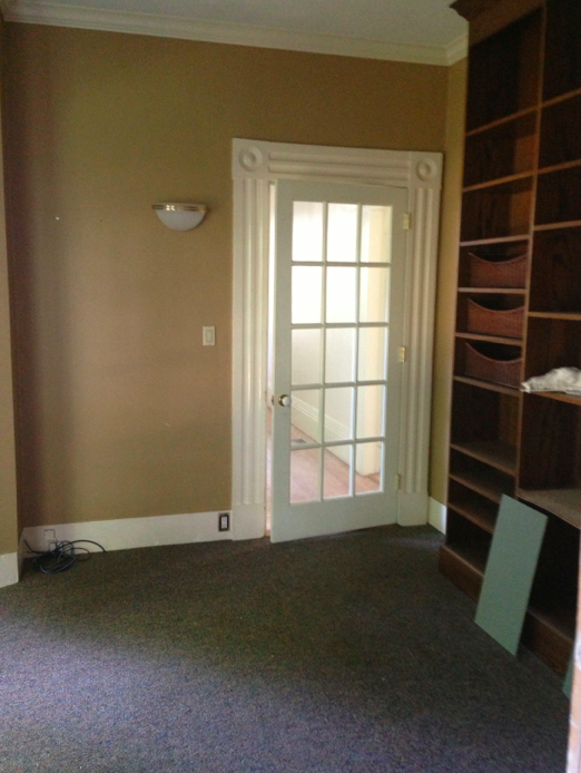
Moving to the "country house," as I like to call this suburban abode, has given me just that.  It's a small in-between room that previous owners have added a floor-to-ceiling book case.  The wood finish was not exactly my favorite.  Before pic:
Immediately when I entered, I knew I wanted to paint out all the walls, trim detail and bookcases the same color.  I toyed with a few historic colors and settled on Farrow & Ball Card Room Green.  I wanted it to feel like an old English library or sitting room.
Here is what it looked like before:


And now... how cozy and fun! 


A few things to note.  I plan to install inexpensive roller bamboo shades.  I am also waiting on the carpet installer to put in wall-to-wall sisal.  I thought it would be done by now, but you know how that goes.

Last and (most important) is changing out the hideous sconces.  I want a great looking brass library sconce.  This, however, has fallen into the "not immediately necessary!" category.  I'll wait to find a great deal or wait until the coffers have been replenished.


*I do realize that the pictures in this post are particularly bad.  The room looks best in the evening, but my iPhone refuses to capture the magic.  For you readers and potential clients: This room rocks in person.  I have not given it justice in these pictures.  It will be better when complete.)


Tuesday, November 5, 2013

powder room power

A powder room is my favorite place to decorate.  It's small and intimate.  It is used for small amounts of time & it requires lighting and a mirror.  Two of my favorite things!  For all of those reasons you can go bold and bizarre or glam and dramatic.  Our last renovation resulted in a super cool powder room.  It was a tiny space, but one of my favorite rooms.

The walls were lined in beautiful walnut flooring thanks to Jeffrey Katz & Kevin Musumano from C & J Katz Studio.  They had this vision on another project and it really worked well for mine. It created this warm enveloping texture.  I painted the ceiling metallic gold while the floors that ran from the kitchen were painted Farrow & Ball's Arsenic.
A truly amazing color.  The contemporary pedestal sink with streamlined faucet had a solid presence.  It looked more or less like this:

and the sconces were
the Punch sconce from one of my favorite resources, Urban Electric Company.
I love EVERYTHING they make.

This time I've made the powder room more classic and glamourous.  I had some more room to work with and have been making design decisions based more on the type of house and re-sale capabilities. Here some pretty drastic before and afters!

Before....
Clunky ugly vanity

Old school gravity toilet with wooden seat, ugh.

Terrible lighting.

I considered re-using the pedestal sink from upstairs.

Or finding a salvaged sink with real history.


But didn't I want to transform the space away from that old-timey look?

I decided on the Gramercy glass washstand from RH:

Painted the walls & trim the same rich blue, Ben Moore's Kensington Blue.  This is a good dark blue that has a touch of gray if you want to keep away from having a nautical feel.

The old threadbare red rug is a great contrast with the wall color.  Also it gives the room an old library feeling.  (Sorry about the toilet paper in view.  It wasn't complete at this stage!)


I choose a metallic pewter paint for the ceiling which combines the golds and silvers.  There is a mix of polished nickel & antique silver in the hardware and some gold tones on two mirrors in the room.  Yes, there is that infinity effect because there are mirrors facing each other.  Very cool in person.


I used the classic Bryant sconce from Visual Comfort because my beloved Punch sconces did not provide enough light.  We couldn't add an overhead chandelier so the two sconces are my only light source.


Moody & chic, non?

The last touch is the window treatment which will be a Roman shade made from this metallic linen that is going to kick ass. 


I'll make an update when the treatments are installed.  Hopefully soon.  I don't want to meet my neighbors that way.

Stay tuned.

xxL

Wednesday, October 30, 2013

Kids' bath

The bath at the top of the stairs is what the kids' share and overnight guests will use.  Some before pictures (which I know are terrible) illustrate the dark blue walls, dark wood trim and Victorian sensibility of the space.


The above three pictures, I am backing out of the room into the top hallway.  Sort of afraid.

Ideally, we would have knocked out the corner where the shower is and installed a large glass enclosure.  It would have really opened up the room and brightened it up tremendously.  After considering budget, time and two teens getting ready for school in the morning, we decided to keep it as is.  It's a private shower with nice simple tiles and is actually quite tall when you are inside.  It's not too cramped.


 Backsplash has to go.  The vanity too.  I saved the faucet for use in the downstairs powder room.  I should note, I kind of wanted to re-use that crazy marble because I think it's super cool.  In this context, it was not cool.  It was just kinda' crazy.


The floors were an ugly color of pink and yellow mashed up.


Choice one for floor paint was Farrow & Ball's Pale Powder.  It was too pale and, frankly, too powdery.  It looked dirty all the time.  And a bit dull.  It would be beautiful on walls of a bedroom, a sun room or a dining room with really dark floors.

I re-used a pedestal sink from one of the bathrooms that we combined to make the master bathroom.  I bought another of the same (Kohler Memoirs) and it made all the difference.  The floor space has grown and it feels much more airy.  You loose storage without a vanity, but there are original built in drawers and shelves that hold all the spill over of towels and toiletries just outside of the door.

New sconces with an additional in the middle helped to brighten the room even further.


We opted for a brand new blue paint that just came out from Farrow & Ball, St. Giles Blue, and are much happier with the result.  I also reused two wall-mounted medicine cabinets from the old master bath and had them painted out white.

I'll include some final styled pictures when I add the updates from the other baths.


A sneak peak on the powder room:


Thursday, September 19, 2013

sneak peak & inspiration

I can't get into the house for the next few days because the floors are being finished.  I love the way the floors are looking and wanted to put up a sneak peak at the kitchen and family room area.  Not completed yet, but it is looking great so far.

Kitchen floor sanded down.

Framing has been done for our fireplace slim down.

Painted cabinets.

Cabinet doors drying in the basement.

Lots of cabinet doors.

Slowly getting there.

Shelves built and awaiting paint.

This is an inspiration tear sheet for the family room that will have a TV over the fireplace.

Another inspiration of the style of fireplace with comfortable seating.


The above three images are inspirations for the formal entry hall, the living room and the dining room.  Just love the white walls.  Makes an old space feel modern.

Have I mentioned how much I love the way the floors look now?

We are down to the wire as we move in next week.  I hope we make it!!